12 Jun 2024
5 minutes read
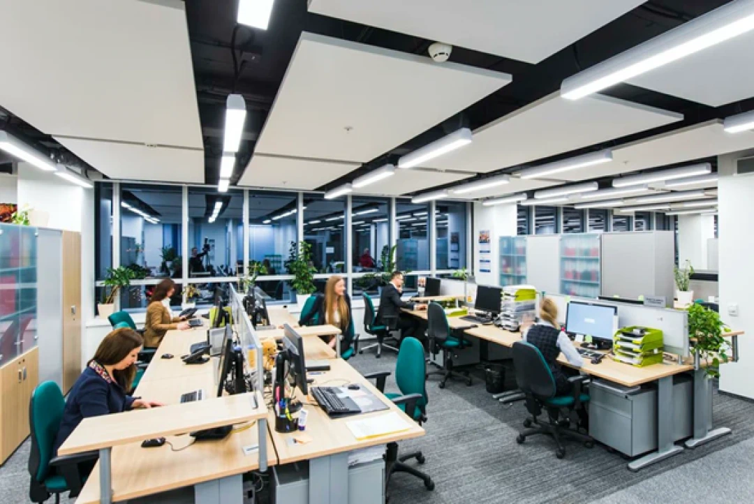
software development
software development
12 Jun 2024
5 minutes read
Blue IT Systems' Visionary Approach to Design Solutions

Welcome to a realm where innovation takes center stage, and technological landscapes are transformed. In this digital age, Blue IT Systems emerges as a pioneer, revolutionizing the industry with cutting-edge design solutions that transcend conventional boundaries. As a trailblazer in the tech realm, we pride ourselves on not just keeping up with the trends but setting them. Join us on a journey through the intricacies of our innovative design solutions and discover how we are revolutionizing the IT landscape.
Table of Contents
- The Evolution of Blue IT Systems
- Blue IT Systems' Design Philosophy
- Blue IT Systems commitment
- Final Thoughts
The Evolution of Blue IT Systems
At the core of Blue IT Systems' success lies a visionary approach to IT solutions. Our company's journey began with a clear vision to redefine industry standards through innovation and creativity. The team at Blue IT Systems shares a passion for pushing technological boundaries, and this drive has set them apart as leaders in the field. Our team of experts, armed with a wealth of experience, meticulously crafts systems that not only meet industry standards but redefine them. From conceptualization to execution, each step is marked by precision, ensuring a final product that outshines competitors.
Blue IT Systems' commitment to excellence is evident in their portfolio of designs. Each project undertaken showcases a meticulous blend of aesthetics and functionality, creating solutions that not only meet but exceed client expectations. The team's ability to combine artistic flair with technological precision is truly unparalleled. In an era where technology is the driving force, Blue IT Systems takes pride in seamlessly integrating the latest advancements into our designs. Whether it's artificial intelligence, machine learning, or blockchain, our solutions are a harmonious blend of diverse technologies, ensuring our clients stay ahead of the curve.

Blue IT Systems' Design Philosophy
Blue IT Systems believes in the seamless integration of art and technology. Our design philosophy revolves around the idea that a well-designed IT solution is not just about functionality but is also an artistic expression. Our unique approach has led to the creation of designs that are not only efficient but also visually captivating. One of the standout features of our design solutions is scalability. In a dynamic business environment, adaptability is key, and our systems are tailored to grow with your organization. From startups to enterprise-level entities, our designs provide a robust foundation that expands effortlessly, accommodating evolving needs.
In an era where user experience is paramount, Blue IT Systems prioritizes a user-centric design approach. Understanding the end-user is the cornerstone of their design philosophy. This approach ensures that the solutions created are not just technically advanced but are also intuitive and user-friendly, enhancing overall satisfaction. User experience is the heartbeat of any successful IT system. At Blue IT Systems, our design philosophy revolves around putting the user first. Intuitive interfaces, seamless navigation, and a focus on user feedback contribute to systems that not only perform but delight.
Blue IT Systems has become a benchmark for excellence in the industry. Our innovative designs have set new standards for IT solutions, inspiring competitors to raise their own bars. The impact of Blue IT Systems is felt across various sectors, from finance to healthcare, as organizations recognize the transformative power of their design solutions. In a digital era fraught with cyber threats, security is paramount. Blue IT Systems understands this and embeds state-of-the-art security protocols into every design. From encryption algorithms to real-time threat detection, our solutions ensure a fortress-like protection for your valuable data.
Blue IT Systems commitment
In the ever-evolving tech landscape, Blue IT Systems remains committed to continuous evolution. The company's R&D department works tirelessly to stay ahead of industry trends, ensuring that their designs are not just current but also future-proof. This forward-thinking approach positions Blue IT Systems as a forerunner in the race for technological innovation. The company's commitment to quality is reflected in its rigorous testing and validation processes. Blue IT Systems ensures that each design solution undergoes comprehensive evaluation to guarantee reliability, security, and performance.
As technology continues to evolve, Blue IT Systems remains at the forefront, consistently pushing the boundaries of what is possible in system design. Whether it's cloud solutions, network architecture, or software development, Blue IT Systems is dedicated to providing innovative and future-proof designs that empower businesses to thrive in the digital era.
Final Thoughts
Innovation knows no bounds at Blue IT Systems. Our unwavering commitment to pushing the limits of design and technology has redefined industry expectations. As we navigate the digital future, the impact of Blue IT Systems on the technological landscape is undeniable. By redefining the standards for excellence in IT system design, Blue IT Systems is helping businesses unlock new possibilities and stay ahead of the curve in an increasingly dynamic and competitive market.
Our Latest Articles and Industry Insights


Our Latest Articles and Industry Insights
